These were ideas I had when VMK was up and running. They will not be added to VMK Revisited, since my intention is to make all of the thing that were part of VMK still available, and to NOT add new, or my items. I really just wanted to put them all in a single location. Most of these have found there way on to the forums for VMK.
Thanks
New Inventory Interface (original idea post April 22, 2007)
This idea should have been been pretty simple to implement. It has a counter on the item in the inventory telling you how many of them you have with you (just like the current inventory, just not picturing every one of them individually).
The thought behind this is that you can see more items, and get a quick count on what you have without having to count across scrolling screens. You should also be able to see more inventory items at a time.
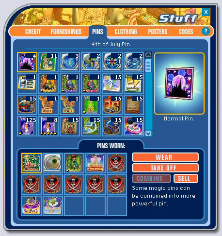
One of the things that you will see multiples pictured of is pins that have star values it would show how many of each value you have (i.e. 125-1 star fireworks pins, 8-5 star fireworks pins).
While the numbering does partially cover the pin, you can see a full image when you click on it to the left as was the case. It is in the upper-right corner to allow you to see the star values.
This would also be an assist in the trade window.
This was implemented, be it from my suggestion or someone else's.
New Trading Interface (original idea post April 22, 2007)
This was one of my ideas to alter the trading interface to allow more to be seen, and more to be traded - including rooms!
With the current trade window you need to scroll too much, and since we can't do anything else while trading, why not take a cue from the Quest engine window and use more of the screen to do a better job at trading.
The trade window for all current items will have a quantity counter (as well as a possible quantity selection for trading). This way you will see a single item with a numerical representation for how many you have. (The number on her was suggested months before anything like it showed up on VMK - It is not a unique idea, but I went to the trouble of visualizing it for people.)
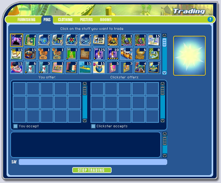
I made the inventory area larger to show more, and if the 15 item is a restriction due to a database reason or for a technical reason, at least we could have seen all 15 items at once, and not have to scroll. If that restriction was lifted, the scrollbar to the right will allow us have more items.
Additionally (but not pictured) the clothing area would have had sub-tabs that hold hats, tops, pants and shoes. This would have allowed for more speed and less scrolling.
The last item that I would really like to have seen is the ability to trade rooms. This version would, for now, require an empty room. You would need to mark in the room information area if the room is tradable (new check box). It would be quicker to clear the room now with the awesome new feature that VMK has provided for us.
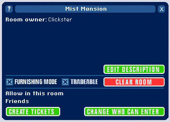
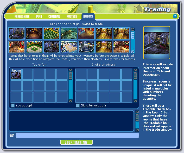
Only rooms that have been marked as tradable would show up in the trade area. if you didn't clear the room, you would be prompted that your items will be moved to your inventory (this should happen once accept has been pressed to keep from clearing rooms inadvertently). This happened when you sold a room. Information about the room's Title and Description will show on the right side under the picture area on a single click, and a double click will move the room to the trade area.
Now...
I would like to be able to trade a room and its contents, but I can see where this could have caused problems if you forgot your favorite black and gold candles were on the side of that cheap chair. So to avoid problems I could reasonably see this as not being a good option. Make the person put what they want to trade in the trade window.
It might be interesting to be able to trade furnished rooms too.
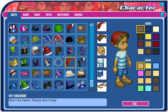
New Character Interface (original idea post April 04, 2007)
Instead of flipping through all the items one at a time, thought we could flip through many at one time (I have 42, but I don't know if they have a limit on the number of items on a screen). It would take less time to see many things at one time and for those hair styles, girls and boys, that don't allow for hats, you don't have to lose your hat when you pass it.
This interface shows everything on the left, and you would have selected it by clicking on a hat etc. a yellow box highlights your selection and it shows in the normal white box on the right. When you used the up and down arrows to the right of the item it shifts the inventory items or appearance items to show the next or previous 7 items.
That about covers it other than labeling the hair and skin areas and moving things a little bit.
Hope you like it.
Select the clothes in the regular tab areas, then go to the Outfits tab and Save the new outfit, or Use it.

Over Under Building Block (original idea post March 21, 2008)
One of the issues with stackable archways and doorways is the ability to walk over the top of something. The most problematic part of this is "Do I allow the person to walk under the doorway, or over the doorway?". Since you can place items on top that do not have this kind of logic, the problem continues.
Basically you would have to set a value/behavior for how the object will work, but you would also need to pass that value/behavior to the object on top of it, and to all other objects on top of it as well. This is really were the problems come in.
Possibly a directional option could be set, but then you would need to have a 3x3 object with blocks on the sides
Here is an image to help make more sense.
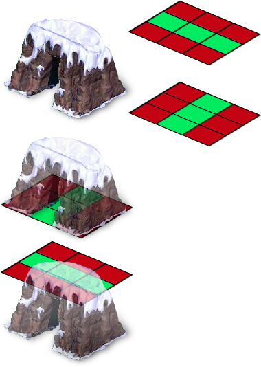
With this you could both pass under and over. This configuration would take away the issue of if it should pass over or under. Just as when you click on the screen the character takes the shortest path, this would do the same. The sides are blocked on the top path, and the ends are blocked on the lower path. if you are in front of the opening on the lower path it will go under, not over. If you are at an end, it will go over, not under. It's all a matter of which path is the shortest because some of the paths are blocked.
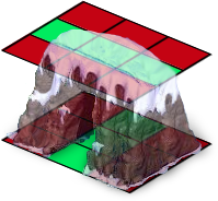
you can see in the image above that the blocked areas are in red, while the passable areas are in green. They crisscross giving different options and forcing an upper or lower route.
And just as you could pass over, you could also stack things on top
Items could only be stacked in the green area above to keep the logic intact.
Rotating Platform (original idea post March 22, 2008)
- This platform is a 3x3 rug-like object.
- A 1x1 version could be made available too.
- You can stack things on it.
- It can be activated by a person getting near it
- It can be active all the time
- It can rotate clock-wise or anti-clockwise (counter-clockwise)
- You can stack them on top of each other for more effects

Would have been helpful to alter the course of a ride to have it be multi path and random.
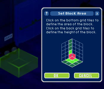
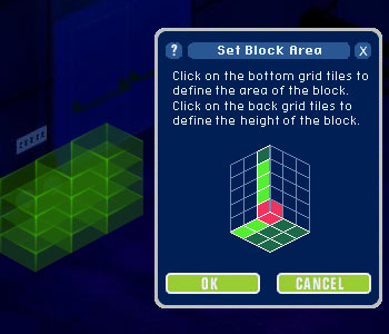
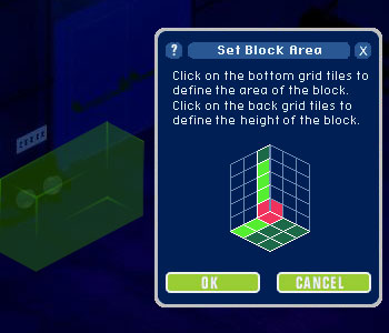
Resizable Transparent Block (original idea post February 27, 2008)
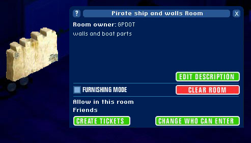
These blocks would have been visible to the room owner when in the Furnishing Mode. At no point would these have been visible to guest unless Furnishing Mode is turned on, and the room owner has turned on the movable property.
They would not be visible to the room owner when the Furnishing Mode is turned off.
Variable Sized Transparent Blocks
I wanted to make these blocks more useful. Since they would predominantly be invisible, the visible graphic can be either stretched (not really) or stacked as multiples; the way it is when you entered a room. When you first enter a room, a Haunted Mansion Table is represented as four squares in a two by two pattern.
To access this resizable feature you would have clicked the item and selected Item Info (the room had to have had Furnish Mode on for this to be visible).
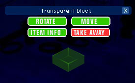
This would have had a new option on it (not pictured sorry) to set the size of the block. Clicking this option would launch a window that will be familiar in that it has been used on the animated objects.
I find it cumbersome to click on an animated object and have this setting pop up as soon as I come into close proximity, so I put the feature in the already available area Item Info.
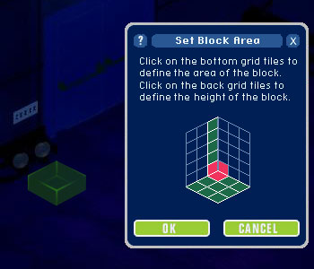
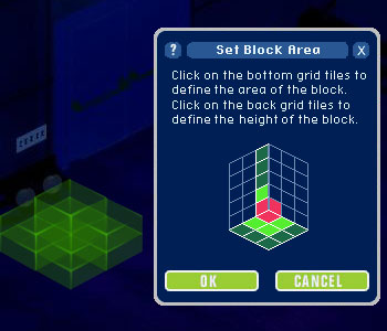
Once you click the size feature, you could have clicked on any of the squares on the bottom to have set the "foot print" of the object, or the number of square it would have occupied as width and depth. You could also have click the back tile grid to make the item taller or shorter.
This feature was in essence no different than the animation setting and would really hold less information (two options instead of four or more).
Below are examples of the grid and a visual of the block as either a multi-piece or single piece object. I think for our purposes it would have been be better to have a single piece, unless the highlight when selected is significant.
As far as programming was concerned:
- This would have used the already available feature of Furnish Mode, but it would require additional code to show or hide the actual piece (to an extent this is already done with the item information bar).
- This would use the system that animated objects already use with a slight interface change.
- It would most likely require multiple states to represent a single item in multiple sizes unless the selection indicator could be increased for this object.
I am sure this object would have been 500-1000 credits because it is sizeable, but the option of having a multiple size object is generally worth it in my opinion. The other option would be to have a couple heights of 1x1 transparent blocks similar to the space posts.
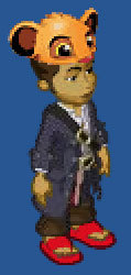
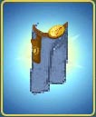
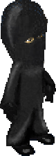
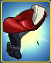
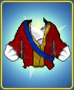
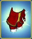
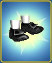
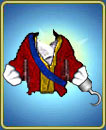
Outfits and Inventory Items
Here is a new Simba hat. The drawings were done by Capt.Draconn (he asked me to color it), and I used StitchMad to model it for me.
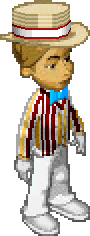
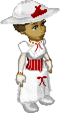
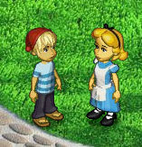
Bert & Mary Poppins (by request)
Woody's Hat, Shirt, and Jeans
Here is the Phantom Blot (by request - well I gave it a try)
Here is a shot at a Captain Hook costume that I would like to have seen added to go along with the super Smee costume.
With Hook (off center, but it would be
small to center it and it's not
symmetrical - Neoteny) |
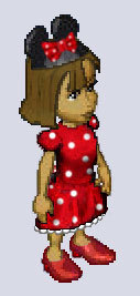
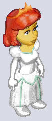
Here is Minnie with new ears and Ariel in a white dress.
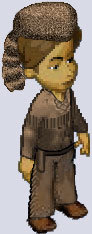
Davy Crockett Outfit (Whole)
 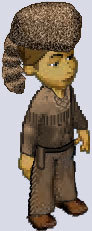
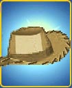
A request was made for a larger hat.
I thought we should have different shoes for Alice too:
 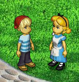 
Frilly socks black shoes Regular socks black shoes Younger Alice - Neoteny request
Here are some old ideas too:
Hats
Hearts
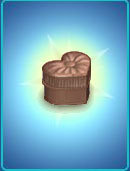 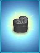 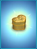
Chocolate heart Black Heart (Captain) Heart of Gold
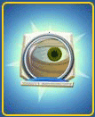
Animated Pin
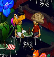 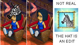
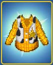
Pluto Hat from Gator hat Zebra Hat - would have preferred a long neck on this one
Different colors of existing items
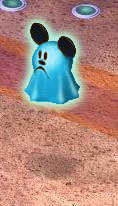 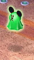 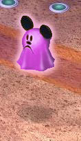 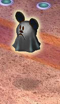
I made the Blue for the ghost Bosses in Haunted mansion and the Green and Pink/purple/fuchsia
for the ghost sides, and was then asked to add a black one since we had orange and white
(just to round out the Halloween theme).
Thank you for looking if you made it this far, and even if you didn't ;).
GPDOT
|